Black Iron Coffee
Branding
Illustration
Packaging
Website
OBJECTIVE
Black Iron Coffee Roasters is a coffee shop in Howell, MI. They pride themselves on roasting their own beans and creating a perfect cup of coffee for the everyday people in their community. I redesigned their brand as a personal project with the intention of creating a design aligned with their mission and values.
AUDIENCE
Black Iron caters to the local, every day, working people. They are about building community and providing great coffee with no frills. Their primary market is working-age people who may commute and appreciate quick and well-crafted coffee to start their day.
SOLUTION
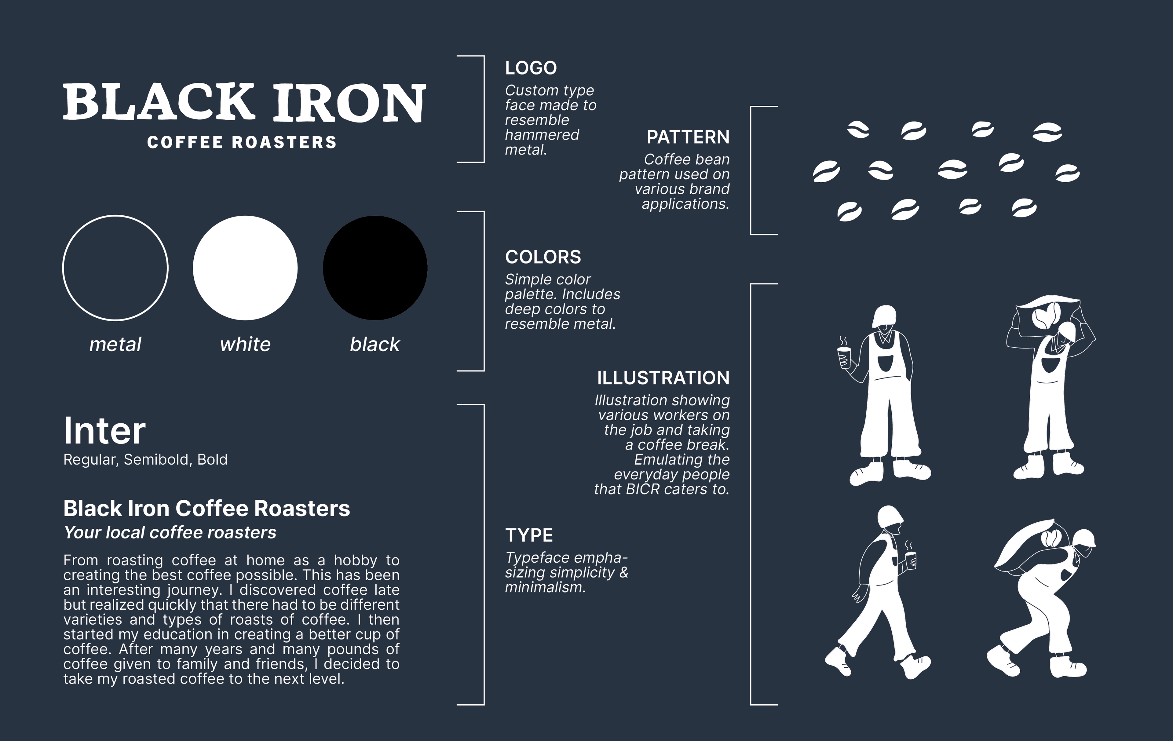
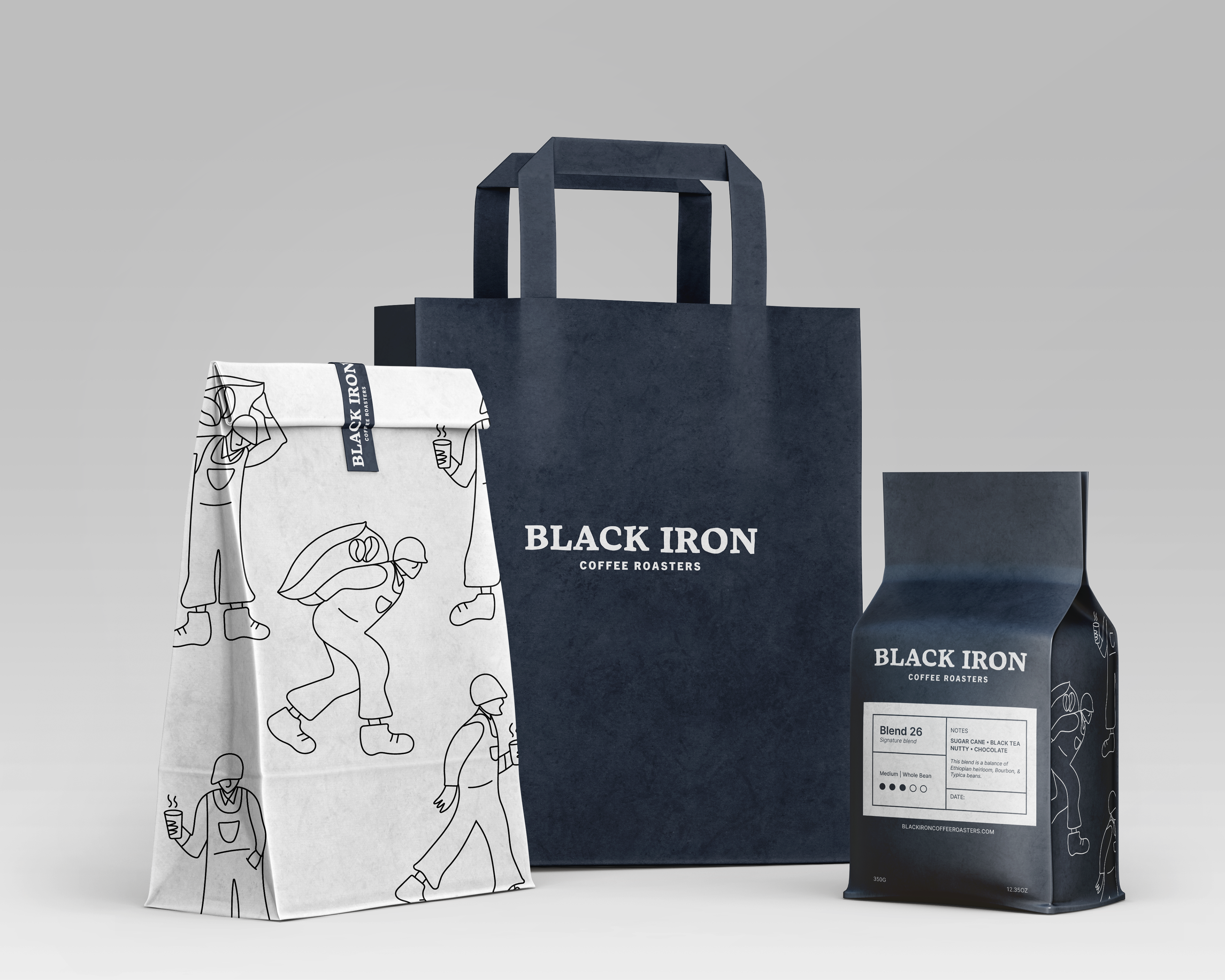
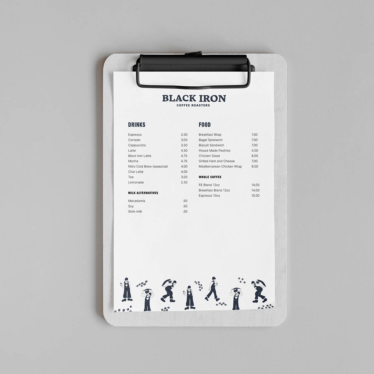
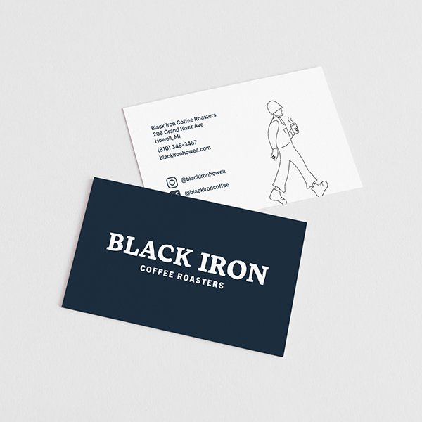
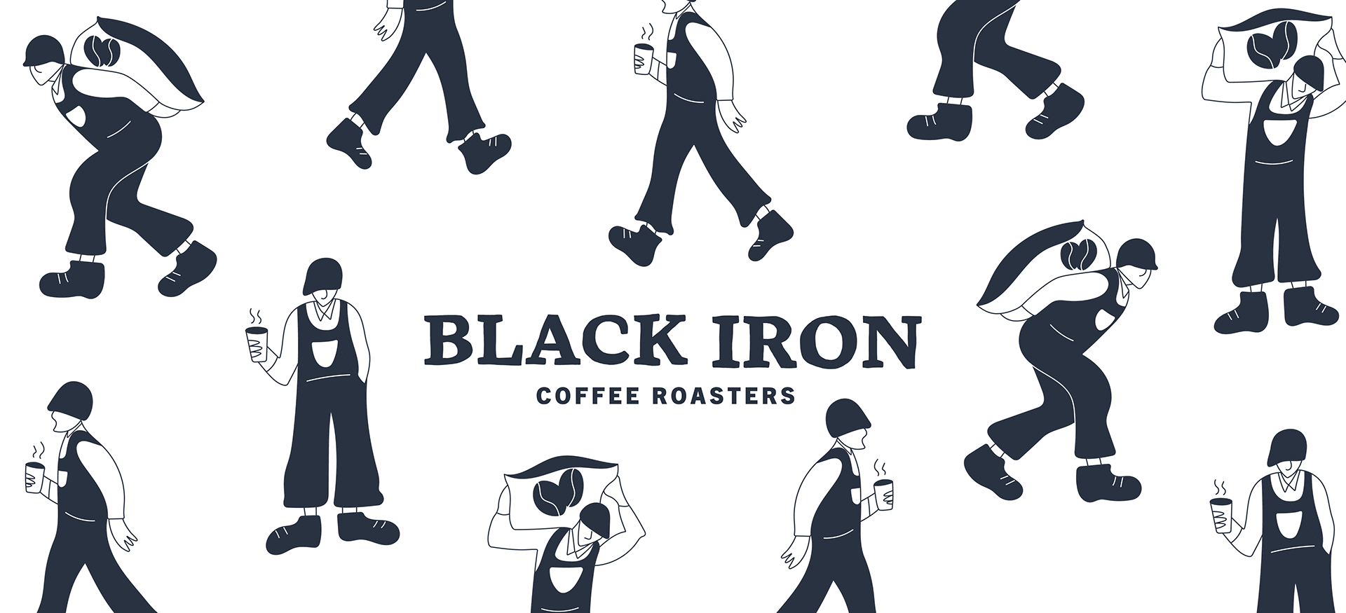
To keep to the to-the-point goal, I used a one-color palette (along with black and white) of a down-to-earth and trustworthy charcoal blue. I wanted to add some personality in the form of illustrations. I made characters who were working, on a lunch break, and drinking their morning coffee while on the go. I modeled them after ironworkers as an ode to the name. The logo is based on a serif font that is redrawn to show a look of hand-hammered metal.

Iron workers ideation sketches
